
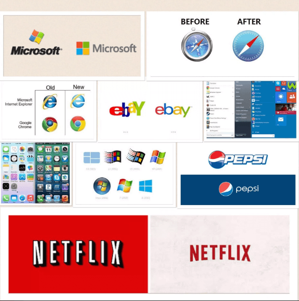
Apple has contributed many things to the tech world, but very few innovations have been as widespread as “going flat”.
Both tech and non-tech companies have begun adapting their logos and designs to better mimic Apple’s flat iOS iconography.
Flat design looks simpler and cool on small devices.
The aesthetic, clean and uncluttered design are also easier to load and scale more with better UX. In earlier days, the logos were equipped with heavy shadows to make the design cool without high resolution but the day has changed where images looks sharp without the boundary.
With adverts now appearing as 5 second Youtube videos, new startups being announced near daily and internet users’ time becoming more and more valuable it has become vitally important that companies have logos that are instantly recognisable.
You can check out some of the best examples of “going flat” below:
More gaming news
How much uncapped ADSL data your ISP can give you before it makes a loss
Entire Polaris graphics card lineup revealed including Radeon RX 490


Pff… Like Apple was first on the “flat” interface bandwagon…
lol